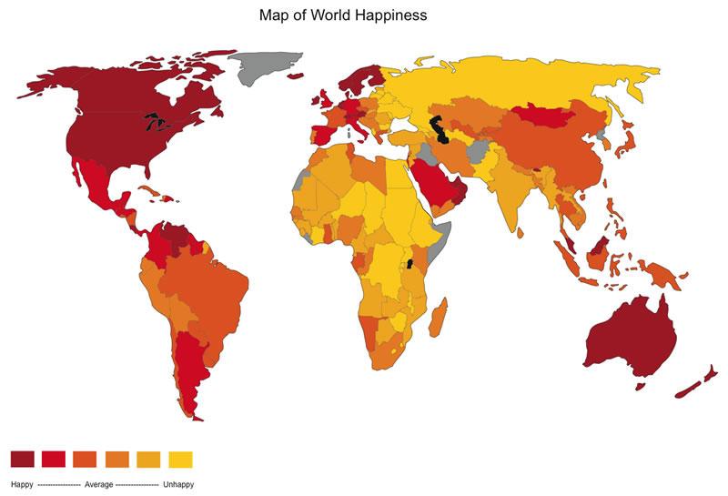
This map is from http://mappery.com/map-of/World-Happiness-Map. It shows the average happiness of people in each country around the world. The average happiness in each country is categorized into a range and then color coded accordingly. I think it's very interesting to see how happiness varies so dramatically around the world, and there are certain regions that are much happier than others.
This map is from http://psychology.wikia.com/wiki/Developed_countries, it show the average income in each country, broken down and categorized into different ranges, then color coded. It's interesting because there are very large differences in incomes around the world, and the high income areas tend to be concentrated in the westernized countries. It is also interesting because there is a strong correlation between the average income in countries and the average happiness; looking at these two maps we can see that the people with more money tend to be happier.


This map is from http://aidwatchers.com/2009/12/world-map-of-remoteness-vs-connectedness-ht-tyler-cowen/. It shows the connectedness, or remoteness of every region in the world. The time it takes to travel to a major city is calculated from each point and coded by hours or days. The darkest colors are the most remote places and the lightest colors are the most urban areas. Shipping routes are also shown by the blue lines. I think this map is really interesting because it shows urbanization very clearly, which is an increasingly important factor in the world today. Also remoteness or connectedness is related to population so this map shows a lot important things.


No comments:
Post a Comment